


Possible Clearing of the Economic / Financial Cloud of Uncertainty
Stock-Markets / Financial Markets 2013 Feb 08, 2013 - 02:34 PM GMTBy: Brian_Bloom

 Summary and conclusion - The (selected) charts are pointing to a rising probability that the cloud of uncertainty that overhangs the world economy – with particular reference to sovereign debt – may be clearing. Specifically, the evidence is (so far, tentatively) suggesting that the banks can be expected to win the war for control over the global economy.
Implications of this are moderately bearish for gold, seriously bearish for gold shares, moderately bullish for the nominal economy, moderately bearish for the real economy; and one implication is that investment in bank shares may be both prudent and profitable.
The analysis below supports the argument of some, that the central bankers’ strategy for repaying sovereign debt will be to deliberately engineer an environment of negative real interest rates against a background of moderate inflation. If, coupled with this, legislation is passed to “manage” the proportion of retirement savings that is invested in government bonds, then this will allow governments to rob Peter (the nouvea riche wealthy and middle class) to pay Paul (those who have lent money to the sovereign borrowers).
All this will happen under controlled conditions where the global economy will remain on an even keel. The big losers will be individuals and legal entities who have made their money over the past 40 odd years by “playing by the rules” of the Fiat Money inflation game – rules that the charts are signalling are about to change.
*******
Below is a series of Point and Figure charts. (All charts are courtesy of stockcharts.com).
For the reader to gain maximum value from this article it will be helpful to understand how Point & Figure charts are constructed. The charts take no account of time. A perpendicular column of Xs denotes prices that rise according to the price movement scale chosen by the chartist. A perpendicular column of Os denotes falling prices. Trend-lines are of secondary importance. Of primary importance are “breakouts” – above previous resistance levels or below previous support levels. For the direction of the price to change from “up” to “down” and vice-versa, the price will need to retrace the number of boxes in the scale that the chartists chooses. Thus, a 3% X 3 box reversal chart will show prices rising (or falling) at the rate of 3% of the previous total; and a reversal of direction will only be charted in the event of a retracement of 3 X 3% = 9%.
Experience has shown that the distance one might expect the price to travel following a breakout will be a function of one of two factors:
- A technical reaction (against the preceding trend) will typically be more violent, the longer the price has been consolidating. As a rule of thumb (not always true) the vertical number of boxes that will follow a breakout will be a function of the horizontal count of unbroken columns that preceded the breakout. (This is known as the “horizontal count” method of price targeting)
- A continuation of an existing trend will be a function of the volatility that preceded it. As a rule of thumb, the number of boxes in the column that was associated with the most recent “run” will be the same as the number of boxes that can be expected in the coming move following the breakout. (This is known as the “vertical count” method of price targeting)
Clearly, it becomes important to decide whether the coming break is a technical reaction or a continuation. The charts below – all sources from Stockcharts.com – have built- in predictors based on the vertical count method.
It should be noted that technical analysts will typically not look at 8% X 3 box reversal charts because this size of move falls outside the parameters of short term trading mentality. I am using them in this article to hone in on bank behavioural “trends”, and a fascinating picture emerges. (Remembering that an 8% X 3 box reversal scale requires a 24% move before the direction of price movement can be deemed to have changed, the bigger the scale the lower the probability that we are witnessing a “false” breakout).
Final confirmation of a change in “trend” arrives when the 45 degree trend-line (either red or blue) is eventually penetrated. Typically, this is of no help to tacticians but it does tell strategists whether they should be in or out of the market as a matter of strategic policy.
With this in mind, let us proceed:
The first two charts are of the price of JP Morgan Chase’s shares.
Chart #1 – 3% X 3 Box reversal P&F chart of JPM
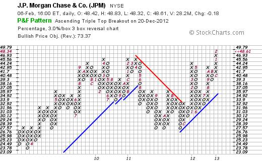
Chart #2 – 8% X 3 box reversal P&F chart of JPM
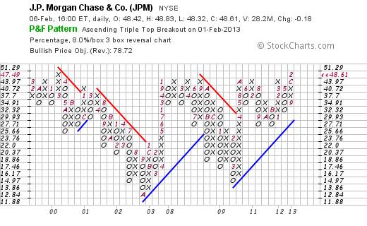
The reader will note that both are giving buy signals but that the second chart is not yet at an all time high. However, given that the prevailing trend line is “blue”, it seems likely that the price will eventually break out to a new high.
The next two charts are of Citigroup’s share price
Chart #3 - 3% X 3 box reversal P&F chart of C
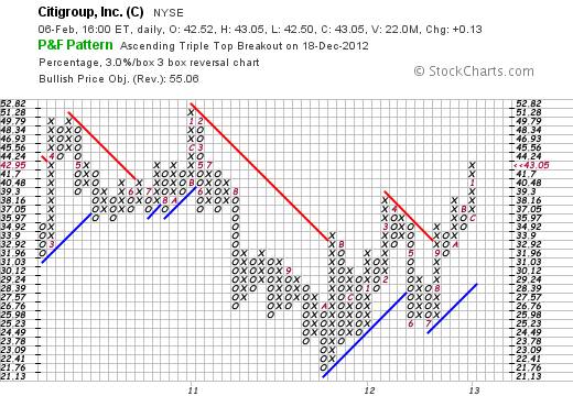
Chart #4 – 8% X 3 box reversal P&F chart of C
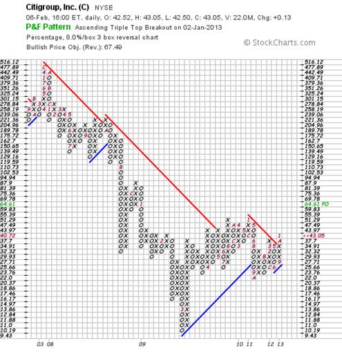
Again, both the above charts are giving buys signals but the 8% scale chart looks like it means business. It has broken above previous resistance and also above the falling red trend line on an 8% move. This is unlikely to be a “false” breakout.
Next are two charts of Bank of America’s share price.
Chart #5 – 3% X 3 Box Reversal P&F Chart of BCA
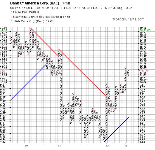
Chart #6 – 8% X 3 Box Reversal P&F Chart of BCA
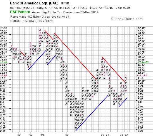
Once again, “serious” buy signals are being given
The next two charts are of the Ten Year US Treasury note yield
Chart #7 – 3% X 3 Box Reversal P&F Chart of 10 Year US Treasury Note Yield
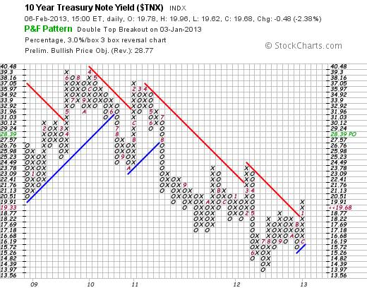
Chart #8 – 8% X 3 Box Reversal P&F Chart of 10 Year US Treasury Note Yield
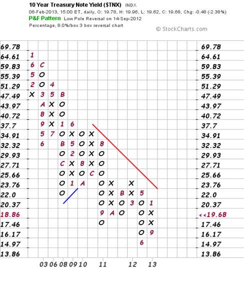
In terms of the first chart that has a target of 2.839%, it seems likely that the red trend line of the 2nd chart will be penetrated on the upside – simultaneously with a penetration of a previous double top (2 columns of Xs).
Note that as this will represent a change in direction, the horizontal count target move will be a function of the number of preceding columns. Including the current column, that number is “6” and the yield can be expected to move up by 6 * 8% = 48% of 2.376% - to a target destination of 3.5%. The charts are therefore anticipating a possible up-move of around 1.5% from the current 10 year yield. The time taken is impossible to anticipate. It might be weeks or years.
I watched a curious video today that, at face value, seemed somewhat fanciful. Its reasoning was roughly as follows:
- The way the world is going to pay off sovereign debt is if inflation exceeds interest rates so that governments can borrow at negative cost. This will transfer wealth from savers (investors) to governments
- It will be done subtly so that the outcome is not blatantly obvious. No “hyperinflation” – just steady erosive inflation against a background of negative real yields
- Legislation will be passed to “force” managers of pension funds to invest a portion of money under management in government bonds – which will maintain monetary capital value over time but the effect will be a loss of real value.
With an open mind, I decided to see what the charts might be saying about this theory. Remarkably, the charts suggest that the theory might warrant serious attention. Here is the reasoning:
If interest rates are rising, then – assuming the above argument is true – we can expect the rate of inflation to increase by (say) 1% - 2% p.a. more than the rise in interest rates. Thus, for example, if inflation is (say) 2.5% p.a. at present and the ten year yield is 2% p.a., then yields are already negative by around 0.5% p.a. (I haven’t checked the numbers, which are likely fudged in any event). By implication, if the 10 year yield is to rise by (say) 1.5% then inflation might be expected to rise from (say) 2.5% to (say) 6% and the US Government will be able to borrow money at negative real rate of 2.5%
But if this is true then why are bank stocks giving buys signals?
Probably because the banks will see the opportunity to raise margins. The commercial banks can currently borrow short term at (say) 1% p.a. (see chart below)
Chart #9 – 3% X 3 Box Reversal P&F Chart of 3 Month US T-Bill Discount Rate
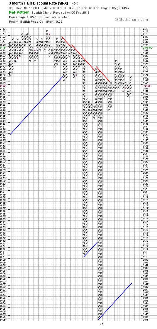
If the banks borrow at 1% and “lend” at (say) 7% spread – i.e. at (say) 8% - then they can make a positive real return of 2% p.a., assuming inflation at 6% p.a.
This implies the following banking strategy:
- Governments will transfer wealth – by stealth – from savers to repay sovereign debts.
- An illusion will be created of growing GDP (in nominal terms)
- Commercial banks will be the main beneficiaries of this strategy
Interim Conclusion #1
The charts are confirming that this proposed sovereign debt repayment strategy may well be in the pipeline. Therefore, a sensible place to invest one’s money will be in banking shares
So what will all this mean for the gold price?
There will be some readers who are aware that this analyst has been talking about a possible “intermediate term” pullback of the gold price within it Primary Up Trend.
I have published the following chart several times and have drawn the reader’s attention to the target move to $1109 an ounce – which remains the prevailing target based on vertical count method.
Chart #10 – 3% X 3 Box Reversal P&F Chart of Gold Price
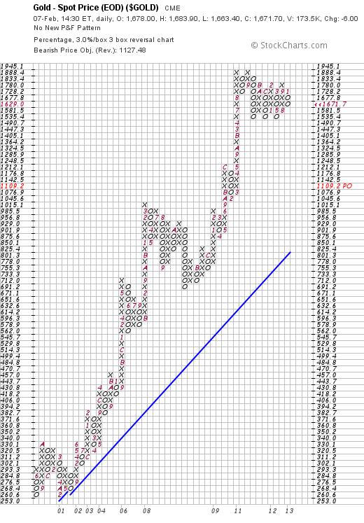
Okay, the time has come to open the Kimono. If the gold price is indeed in a Primary Up move, then the anticipated target move needs to be calculated using the horizontal count method. There are 6 unbroken columns that precede the current one. Therefore, if a break “down” should occur below $1535, a target move of 7X3% = 21% of $1535 can be expected – to a target of $1,212 – which happens to be the exact same row that the previous resistance was broken on the upside. As all technical analysts understand, previous resistance equates to future support, so the $1,212 is believable. Once again, timing is impossible to anticipate: It might be weeks or years; and the target might even be negated if the gold price rises above $1,888.
Will it?
Based on the charts above, probably not.
As an aside, it might be of interest to some that, when I first mooted the possibility that the gold price might fall, I was deluged with “hate mail”. So, in the interests of keeping the discussion rational and sensible, let’s look at the logic that flows from the above charts:
Let’s not forget that the gold price is a barometer of “fear” in the battle for supremacy between responsible financial management of the world economy and those who would retain control thereof – regardless of consequences to others - namely the banking sector in general and the central banks in particular.
Yes, the above strategy might lead to inflation and negative real returns to sovereign lenders (cost to sovereign borrowers) – and this would ordinarily translate to a rising gold price – IF THE WORLD WAS HEADING TOWARDS A GOLD STANDARD.
But a “gold standard” is the very last thing that the bankers want – so the gold price is ultimately a means of measuring who is winning the battle for supremacy.
If the above strategy works, then the bankers will retain control – which implies that the gold will no longer be viewed as a “currency” and it will revert to being viewed as a commodity.
So let’s look at the ratio of gold:commodities
Chart #11 – 3% X 3 Box Reversal P&F Chart of The Gold Price/$CRB
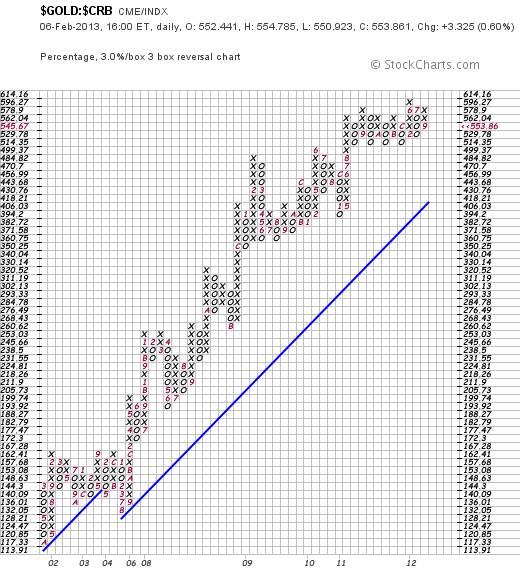
The above chart is showing extraordinary resistance to further up-moves of the gold price relative to commodities, and the number of vertical columns that precede this one is 10. If the ratio were to fall below 514.35, it can be expected to fall – as a rule of thumb – by 33%
Clearly, if it breaks up, then gold will win the battle for supremacy and the banks will lose. The ratio will likely rise by 36% if the break is up
So, given the buy signals that are being given on the banking charts and the Bond Yield charts, what can we conclude?
Interim Conclusion re gold:
The probabilities of the relative strength chart breaking to new highs are low. The gold price will unlikely rise above $1888 and may fall as low $1212 an ounce – within its Primary Bull Trend
Author Observation:
Perhaps this is why the gold shares have been so weak relative to gold. At the end of the day, gold miner profits are highly geared to two things:
- The gold price
- The cost of borrowing
If the banks are going to win this war, and one implication is that they are going to raise lending margins, then gold mine profits will be caught in a pincer of falling gold price and rising costs of borrowing.
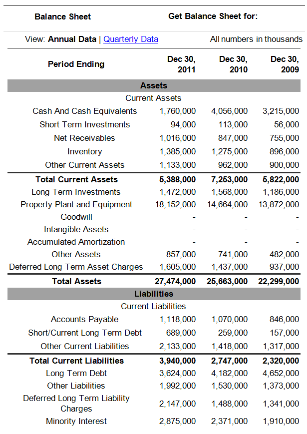
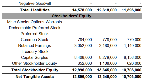
Below is the balance sheet of Newmont Mining (http://finance.yahoo.com/q/bs?s=NEM+Balance+Sheet&annual )
Note how NEM’s cash balance has been falling over the years and how money has been ploughed into long terms assets. $19.6 billion (2011) from $15 billon (2009)
How have these extra $4.6 billion assets been financed?
Well:
- Short term debt has risen from $157 million (2009) to $689 million (2011). Some of this is actually long term debt that is falling due for repayment
- Long Term debt and deferred charges – when added together – have remained fairly constant at around $6 billion
- Retained earnings have risen by around $2 billion
- Minority interests have risen by around $1 billion
- Other current liabilities have risen by around $700 million
- Other bits and pieces
Newmont Mining Corp. (NEM)
-NYSE
45.04 Feb 6, 4:00PM EST
Analysis
Newmont has been relying on short term liabilities to fund long term assets. This will put them in a position of negotiating weakness in the event of a credit crunch.
As long term debt falls due for repayment, the banks will either make it harder for Newmont to roll over its debts or they will raise the amount they charge for long term money.
Now, when we look at how much interest Newmont has been paying, we see the following:
2009: $120 million
2010 $279 million
2011: $244 million
And when we look at the actual profits of Newmont, we see the following:
2009: $1.297 billion
2010: $2.277 billion
2011: $366 million (because the gold price has not been rising)
Assuming that interest rates charged by the banks rise by (say) 3.5%, then Newmont’s borrowing costs will rise by at least 3.5% of $4.5 billion = $157 million.
Interim Conclusion re future profitability of gold mines in general
If the gold price remains flat or falls by (say) a further $300 an ounce then, coupled with rising costs of capital, the profitability of gold mines will come under significant pressure.
Chart #12 – 3% X 3 Box Reversal P&F Chart of Newmont Mining Corp
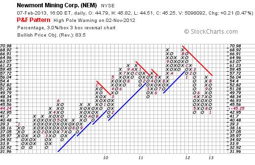
Author comment: Of great interest here is whether the fall from 68.92 to 42.95 was a reaction within a Bull Trend or whether it was the beginning of a Bear Trend. If the latter, then the retracement level of $56.04 has already met the horizontal count target reaction. If so, and if the price of Newmont should fall below $42.95, it might fall by a further 36% based on the vertical count method. In turn, this would be consistent with a profit rout flowing from falling gold price and rising borrowing costs.
Overall Conclusion
The ratio of gold shares to the gold price is critically important. Many believe that the gold tide may be turning for the better. Of course, it might well do so, but if that ratio starts to give sell signals then it will be an indicator that “the market” believes that the banks will retain control over the world economy. Right now, “the market” has already voted with its feet regarding future profitability of the banks. Are you prepared to bet against “City Hall”?
Author, Beyond Neanderthal and The Last Finesse
Beyond Neanderthal and The Last Finesse are now available to purchase in e-book format, at under US$10 a copy, via almost 60 web based book retailers across the globe. In addition to Kindle, the entertaining, easy-to-read fact based adventure novels may also be downloaded on Kindle for PC, iPhone, iPod Touch, Blackberry, Nook, iPad and Adobe Digital Editions. Together, these two books offer a holistic right brain/left brain view of the current human condition, and of possibilities for a more positive future for humanity.
Copyright © 2013 Brian Bloom - All Rights Reserved
Disclaimer: The above is a matter of opinion provided for general information purposes only and is not intended as investment advice. Information and analysis above are derived from sources and utilising methods believed to be reliable, but we cannot accept responsibility for any losses you may incur as a result of this analysis. Individuals should consult with their personal financial advisors.
Brian Bloom Archive |
© 2005-2022 http://www.MarketOracle.co.uk - The Market Oracle is a FREE Daily Financial Markets Analysis & Forecasting online publication.