


Incredible Gold Charts Show Bullish Outlook
Commodities / Gold and Silver 2012 Oct 31, 2012 - 11:41 AM GMTBy: Peter_Degraaf

 Technical analysis is a great tool for analyzing where the market has been. Since human beings almost always behave in cyclical fashion, we can observe patterns in market action that tend to repeat. Combined with fundamental studies, TA is applied to the markets by virtually all of the successful traders.
Some patterns occur so often that names have been assigned to these patterns such as: ‘Head and Shoulders’, ‘Cup with Handle’ and ‘A.R.A.T.’
In this essay we draw your attention to another pattern that recently occurred on the gold charts, for only the fourth time in the past seven years. Each time it appeared during the past seven years, it precluded a strong advance.
The pattern is called: ‘Golden Cross’, or ‘Bull Cross’. Here is a chart (all charts courtesy Stockcharts.com unless specified), that has a blue arrow pointing to the pattern we are referring to.
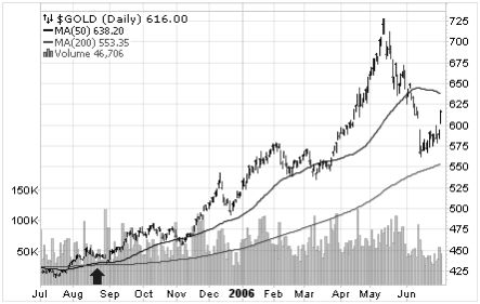
During August of 2005 the 50DMA crossed over the 200DMA for a ‘Bull Cross’. Gold was trading at $435. Nine months later gold reached $725.
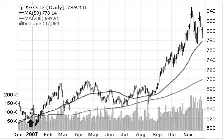
During December 2006, gold once again produced a ‘Bull Cross’. Gold was trading at $625. Eleven months later gold reached $850.
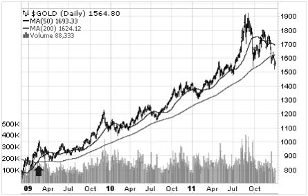
During March 2009, gold again carved out a ‘Bull Cross’. Gold was trading at $900. Thirty months later gold topped out at $1920.
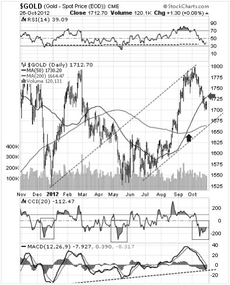
Featured is the daily gold chart. A few weeks ago the 50DMA once again moved into positive alignment with the 200DMA (blue arrow). For confirmation we wait till both moving averages are rising (as now). When price closes above the green arrow we will make the assumption that the pullback that began in early October has run its course. The RSI at the top of the chart has changed from overbought to oversold. The MACD at the bottom of the chart is back at a year-old support line. The CCI just below the chart is making its customary bottoming confirmation pattern (green boxes). How high will the gold price go this time? In order to match the 2006 advance, price could reach $2740; to match the 2007 performance gold would top out at $2640, but in the event that gold matches the performance of 2011 we could see gold trading at $3,330. According to Mark Twain ‘history does not always repeat, but it often rhymes.’
But what about the fundamentals? After all we need two wheels on the cart for balance. The energy for the current bull market in gold comes from several sources:
#1: Budget deficits.
#2: Negative interest rates (CPI higher than short-term interest rates).
#3 Increasing money supply, (more dollars and Euros chasing a limited amount of gold ounces.
The next chart is a good example of item #3.
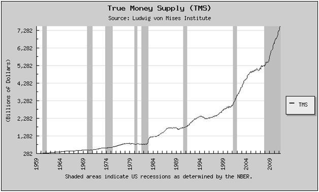
This chart courtesy Mises.org shows the U.S. money supply is rising exponentially. The grey bars indicate a recession is underway. The Obama recession is now the longest recession since the Great Depression. As long as the recession continues, the money supply can be expected to rise since politicians cannot seem to stop spending.
Well, and what about silver? Surely when gold rises, we can expect silver to advance as well?
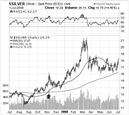
Featured is the daily silver chart from 2005 – 2006. Notice how the 50DMA rose above the 200DMA as it produced a ‘Bull Cross’. The rally that followed moved silver from 7.50 to 15.25, for a 100% increase.
This silver chart highlights the next time this pattern presented itself. It was November 2007. Silver was trading at 14.50 and the subsequent rally took price to 21.00, for an increase of 45%.
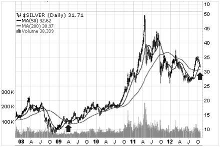
This silver bar chart shows the next time price produced a ‘Bull Cross’ (in April of 2009). Price rose during the subsequent rally from 14.00 to 49.50, for an increase of 250%. At the right of the chart you can see where price is just now completing its latest ‘Bull Cross’. For a close up look we present the next chart.
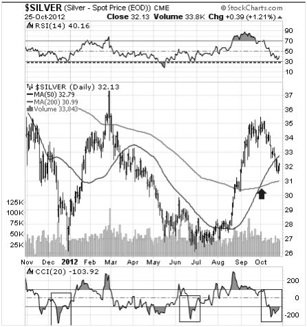
Here is a close-up look at silver’s latest ‘Bull Cross’. Will we see a 100% increase like we did in 2005? Or a 45% price rise like 2007? Or how about an increase of 250% just as in 2011? Time will tell. (In the event that silver matches the 2011 performance, price would top out at $130.) In the meantime the silver bulls can take comfort from the fact that the RSI (at the top of the chart) is at previous support levels, while the CCI (at bottom of chart) is repeating a bottoming pattern (see blue boxes).
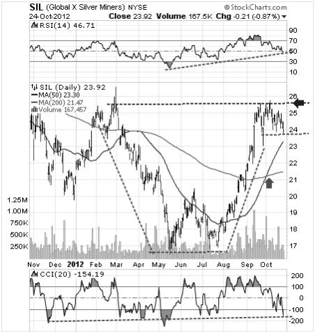
At the same time SIL, the silver producers ETF is carving out a bullish ‘cup with handle’ formation. A breakout at the blue arrow will be the trigger for the next rally. The green arrow points to the by now familiar ‘Bull Cross’.
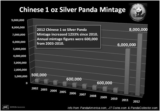
This chart courtesy SRSrocco and Silverdoctors.com shows a dramatic increase in the number of Chinese 1 ounce silver Panda coins. Every Panda removes an ounce of silver from the market.
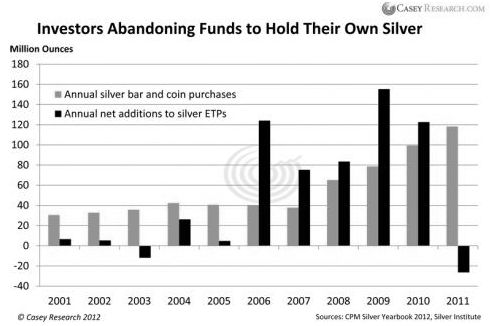
This chart courtesy Casey Research, (based on information from the CPM Yearbook), shows silver investors moving out of ‘paper silver’ and ‘digital silver’ (black bars), into physical silver (orange bars). As more and more investors opt for physical silver, this trend will make it increasingly difficult for traders in ‘digital silver’ to dictate the price at which physical silver is bought and sold.
Finally – one last chart!
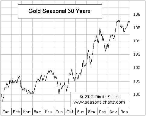
This chart courtesy Seasonalcharts.com shows the seasonal tendency for gold to produce a rally after the October lows.
Happy trading!
By Peter Degraaf
Peter Degraaf is an on-line stock trader with over 50 years of investing experience. He issues a weekend report on the markets for his many subscribers. For a sample issue send him an E-mail at itiswell@cogeco.net , or visit his website at www.pdegraaf.com where you will find many long-term charts, as well as an interesting collection of Worthwhile Quotes that make for fascinating reading.
© 2012 Copyright Peter Degraaf - All Rights Reserved
DISCLAIMER: Please do your own due diligence. I am NOT responsible for your trading decisions.
Peter Degraaf Archive |
© 2005-2022 http://www.MarketOracle.co.uk - The Market Oracle is a FREE Daily Financial Markets Analysis & Forecasting online publication.