


Making 9 Million Jobless 'Vanish': How The U.S. Government Manipulates Unemployment Statistics
Economics / Unemployment Mar 14, 2012 - 03:22 AM GMTBy: Dan_Amerman

 When we look at broad measures of jobs and population, then the beginning of 2012 was one of the worst months in US history, with a total of 2.3 million people losing jobs or leaving the workforce in a single month. Yet, the official unemployment rate showed a decline from 8.5% to 8.3% in January - and was such cheering news that it set off a stock rally.
How can there be such a stark contrast between the cheerful surface and an underlying reality that is getting worse?
The true unemployment picture is hidden by essentially splitting jobless Americans up and putting them inside one of three different "boxes": the official unemployment box, the full unemployment box, and the most obscure box, the workforce participation rate box.
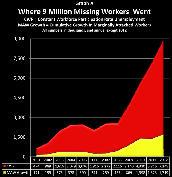
As we will explore herein, a detailed look at the government's own data base shows that about 9 million people without jobs have been removed from the labor force simply by the government defining them as not being in the labor force anymore. Indeed - effectively all of the decreases in unemployment rate percentages since 2009 have come not from new jobs, but through reducing the workforce participation rate so that millions of jobless people are removed from the labor force by definition.
When we pierce through this statistical smoke and mirrors and factor back in those 9 million jobless whom the government has defined out of existence, then the true unemployment rate is 19.9% and rising, and not 8.3% and falling.
For the small percentage of people who are aware that the purported decline in unemployment rates is primarily based on the mysterious rapid decline in "labor force participation rates" rather than the number of new jobs, the government has a ready and sensible-sounding explanation: the Boomers are beginning to retire in large numbers, and with an aging population, the percentage of adults who are in the workforce should logically be declining.
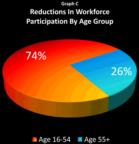
Based on in-depth analysis of the government's own numbers, we will present herein the true picture: 74% of the jobless who have been removed from unemployment calculations are in the 16-54 age bracket, with only 26% in the 55 and above bracket. Yes, the population is aging - but the heart of the workforce participation deception isn't about the old.
In an extraordinarily cynical act, the government is effectively saying that because the job situation has been so bad for many millions of unemployed people in their 40s, 30s, 20s and teens, they can no longer be considered to be potential participants in the work force at all. Because there is no hope for them - they no longer need to be counted. And it is this steady statistical cleansing from the workforce of the worst of the economic casualties - of these very real millions of individual tragedies - that is being presented as a rapidly improving jobs picture.
What the government's statistical deception is hiding is a catastrophic degree of change in generational employment levels, with the situation being much worse for the young and middle-aged than what is publicly presented. As the fundamental force of aging Boomers increasingly collides with the fundamental force of an employment disaster among younger Americans, the results may change everything that we think we know about economic growth, budget deficits, Social Security and Medicare, as well as all categories of investments.
Headline Unemployment (Box 1)
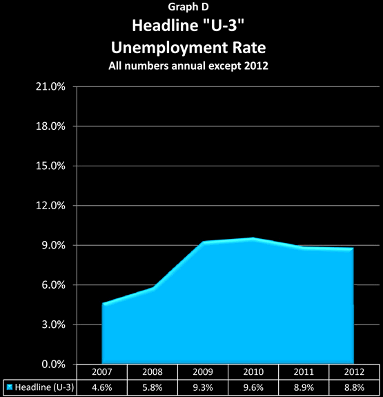
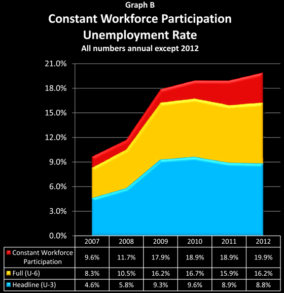
The graph above is our starting point and first "box". It shows the "headline" U-3 rate of unemployment in the US from 2007 through 2012 which is featured in newspaper articles and discussed on the cable business news. The rates shown are annual averages, except for 2012.
According to the Bureau of Labor Statistics, in January of 2012 the civilian labor force was 153.5 million people, of which 13.5 million were unemployed. Thus the actual unemployment rate was 8.8%, and seasonal adjustments dropped the reported unemployment rates to 8.3%.
(The raw numbers without seasonal adjustment were that unemployed people rose from 12.7 million in December to 13.5 million in January, for a net of 800,000 people losing their jobs in the real world, with the cheery and widely reported 0.2% single month decline in unemployment existing only inside the adjustments within the models.)
Full Unemployment (Box 2)
The U.S. Bureau of Labor Statistics calculates unemployment 6 different ways, U-1 to U-6, and it is only in the U-6 statistic that all the categories of unemployment are added together.
The two biggest differences between the U-3 official rate of unemployment and the U-6 full rate of unemployment are in the treatment of the long-term unemployed and involuntary part-time workers. For example, if you've been out of work for a long time and you badly want a job, but you know from your long search that nobody in your area is hiring; you already have applications on file at every reasonable prospect, and you haven't filled out a new application recently - then from an official (U-3) perspective, you are not only no longer unemployed, you just became a non-person altogether.
Alternatively, if you have a master's degree in engineering, lost your job, and are working 15 hours a week (the most you can get) in a convenience store at minimum wage to keep a little money coming in, then from an official (U-3) perspective you would be fully employed.
In contrast, U-6 is a more inclusive measure of unemployment, as it includes both the long-term unemployed and the involuntary part-time categories. Thus, individuals in each of the situations described above would be included in the U-6 measure.
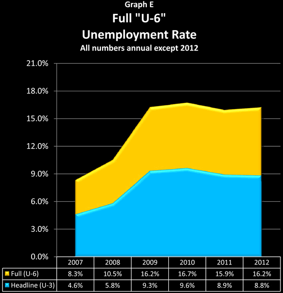
The yellow area in the graph above illustrates what happens when we look at the full, U-6 measure of unemployment. There are an additional 11.8 million people in the US who are considered unemployed under the broader U-6 measure, but not under the headline U-3 measure. When we include these long-term and discouraged unemployed, that means that there are 25.3 million unemployed, and our unemployment rate almost doubles, as we go from 8.8% to 16.2% of the civilian work force being unemployed.
In other words, the real unemployed go from the headline one-in-twelve workers, to one-in-six workers.
Understanding Workforce Participation & Unemployment
The term "Workforce Participation Rate" sounds so dull that it could put even an economist to sleep. And for most of our lives it has in fact been a remarkably boring statistic, changing only at an excruciatingly slow pace. However, in recent years and months, "labor force participation" has become a mystery worthy of CSI or Sherlock Holmes. Bizarre, inexplicable things are happening quite rapidly within this dry and deeply obscure measure. And, by fascinating coincidence, if these odd reductions in the workforce participation rate were not occurring, then the picture of the economy and employment that is being presented to us - changes radically. Consider the following chart:
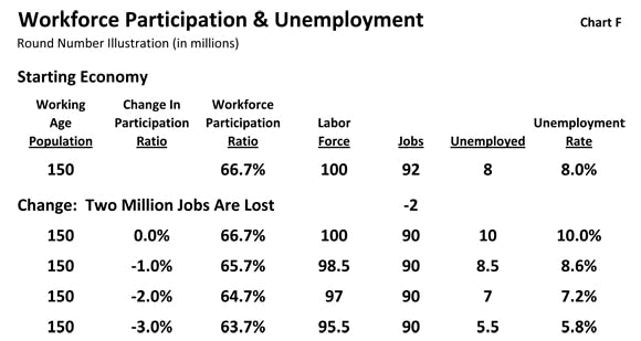
To understand how this obscure term not only relates to but actually determines the very hot topic of unemployment rates, let's take a quick look at a round number example of an economy, with 150 million adults, and say that of those adults, 100 million people want jobs. The other 50 million are not part of the labor force by either choice or circumstance: it could be they are stay-at-home moms, or in school full-time, or retired, or have physical or mental disabilities which prevent employment.
When we divide 100 million by 150 million, that is a workforce participation ratio of 66.7% (which is close to the US norm over the last 20 years). And when we calculate unemployment - we only look at the workforce, i.e. people who want jobs. If 92 million people have jobs, then our unemployment ratio is calculated by looking at the 8 million people who want jobs but don't have them, and dividing them into the labor force of 100 million people, which means that the unemployment rate is 8.0%. This is shown as the "Starting Economy" in the chart.
Now, let's assume that 2 million jobs are lost, meaning that now only 90 million people are employed. If there is no change in the workforce participation ratio, then it is pretty simple: 10 million jobless people out of 100 million people who want jobs, means the unemployment rate jumps up 2% to exactly match the 2 million jobs lost.
If the workforce participation ratio were to fall by 1%, however, then that would mean 1.5 million people would have left the workforce (keeping in mind the ratio is based on the total 150 million working age population, not the labor force). There are still only 90 million jobs, same as with our 10% unemployment rate above, but because "the workforce" has been reduced, we now subtract 90 million employed from 98.5 million in the workforce, and find there are only 8.5 million unemployed people. And when we divide those 8.5 million into our modified workforce of 98.5 million, unemployment has now risen to only 8.6%.
In other words, revising our workforce participation rate downwards by 1% made 1.5 million jobless people just plain disappear, and dropped the unemployment rate from 10.0% down to 8.6%.
That's pretty remarkable, but not nearly as remarkable as what happens if we drop the workforce participation ratio down by 2.0%. As can be seen in the next line in the table, that doesn't change the fact that 2 million fewer people have jobs. But because 3 million jobless people have now been removed from the unemployment calculations, we now have an almost miraculous situation: the unemployment rate doesn't rise at all, but falls to 7.2%, with only 7 million unemployed out of a labor force of 97 million people.
For a true miracle, however, we need to move the workforce participation ratio down by 3.0%. The removal from the labor force of 4.5 million jobless people completely overwhelms the technicality of there being 2 million fewer jobs, and sends the unemployment rate plunging to 5.8%. Break out the champagne, because as the official unemployment figures now prove: the economy is surging and happy days are here again!
The secret to our miracle is that we have two "hard" numbers and one "soft" number. The "hard" numbers are the total working age population and the number of actual jobs. The "soft" number is the definition of what percentage of the working age population wants a job. And a government which desires to control public perceptions can, by manipulating that obscure definition, make the reported unemployment rate "sit, roll over or bark like a dog" at will, almost regardless of what is actually happening with jobs.
Workforce Participation: Box 3
According to the government, among civilian Americans who were 16 years and older and not in prison or otherwise institutionalized, the number who were participating in the labor force fell by an astounding 0.4% in the first month of 2012 alone, which was a reduction of almost a million people. They didn't have jobs, they were counted the month before, but they can't be counted now, according to the government, because they aren't in the labor force anymore.
About 309,000 are already included in the change in our U-6 unemployment measure, but the other 654,000 just don't count anymore. Which between headline unemployment, full unemployment and people just disappearing from the labor market, brings us to the total of a full 2.3 million person reduction.
Box 1: Headline Unemployment (U-3) 777,000
Box 2: Full Unemployment (U-6) 848,000
Box 3: Additional Workforce Shrinkage 654,000
Total Job Losses & Workforce Shrinkage 2,279,000
To see the bigger picture - and a pattern that Sherlock Holmes might find quite easy to identify - let's take a look at population and employment from the years 1998 to 2012 in the chart below (all numbers are annual average except for 2012, which is January only).
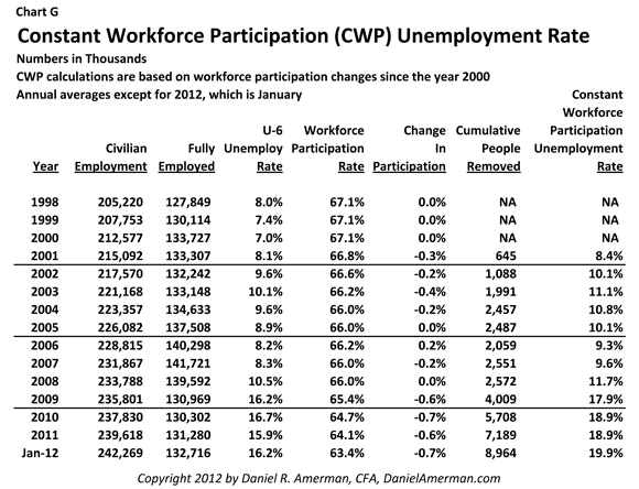
The "Civilian Population" column includes everyone over 16 who isn't in the military and isn't institutionalized, and the "Fully Employed" column shows all employed persons, less those who involuntarily have part time employment.
Prior to 2001, workforce participation had been unchanged at an annual average of 67.1% for four straight years. Obscure, and about as exciting as watching paint dry.
Then there was a recession. To help see the correlation with the overall economy and purported employment situation, there is also a column showing the U-6 unemployment rate, which climbed for 3 years between 2001 and 2003. By interesting coincidence, the workforce participation rate suddenly started moving, and dropped by 1.1% in four years, as can be seen in the "Change In Participation Rate" column.
This may not sound like much - but as shown in the "Cumulative People Removed" column, this 1.1% drop happened to remove 2.5 million people without jobs from both the labor force and the unemployment numbers. Most were never put back, but became a permanent reduction in the unemployment rate, as a result of the government simply defining them out of existence.
From 2003 through 2008 we then go back to watching paint dry for six straight years, as the annual average labor force participation rate stayed within the narrow 0.2% band of 66.2% to 66.0%.
Then the biggest employment crisis since the 1930s hits in late 2008 - and by some mysterious coincidence, the labor force participation rate instantly becomes a fast moving statistic. It drops 0.6% in the year 2009 alone - and in the process, just happens to remove 1.4 million people without jobs from both the labor force and the unemployment numbers. There are drops of 0.7% and 0.6% in 2010 and 2011, making another 3.1 million people without jobs entirely disappear from view.
2012 workforce participation started with a sizzling 0.4% decline, removing a million people without jobs from the labor force statistics in one month - as the band played on, and the cheerful labor statistics helped the stock market indexes climb.
The last column, "Constant Workforce Participation" (CWP) unemployment rate shows what unemployment statistics would have been in each year if the government did not keep permanently removing millions of jobless people from the unemployment rate calculations. This is a modified U-6 full unemployment calculation, that includes the officially unemployed, involuntary part-time workers, and the 9 million people without jobs who have been cumulatively defined out of the workforce.
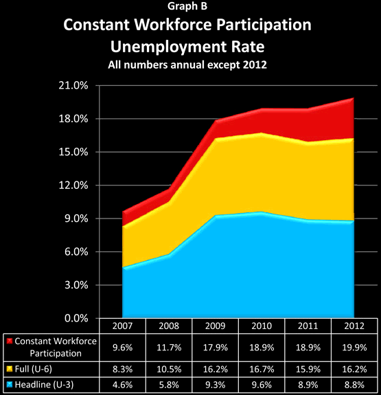
When we include all of the first three boxes of unemployment, then the purported improving employment situation for the beginning of 2012 disappears altogether, and is replaced by a sobering statistic: in January of 2012 the unemployment rate reached 19.9% for the first time in this crisis. The situation is not improving - indeed, it is getting worse again.
To see exactly how the CWP numbers are calculated, click here to read "The Calculation Of Constant Workforce Participation Unemployment". This more technical article provides the methodology and equations, as well as significantly more information on the different classifications of the jobless over time, including the numbers behind the dramatic slope of Graph A in the introduction.
Changing Trend Lines & Narratives
At first glance, the red CWP addition to the graph may have seemed relatively minor compared to the larger U-3 and U-6 unemployment problem, as it is the smallest of the three "boxes". However, when we include Constant Workforce Participation, we change both the narrative and the longer-term trend line. Indeed, we don't just change them, we entirely transform them.
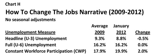
As we can see above, there is a compelling and accepted narrative that the unemployment rate is falling, and we can read about it in every newspaper. Just look at the numbers, and even without seasonal adjustments, the rate is down by half a percent since 2009.
Include both U-6 and CWP unemployment, however, and real unemployment is up by 2.0%. What the rapid removal of millions of people from the unemployed rolls has accomplished, is to allow an entirely different narrative to be used when discussing what is happening.
Unfortunately, there is an even more serious implication as well, and that has to do with the trend lines.
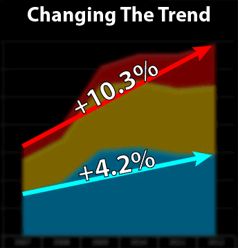
The blue arrow is the Headline U-3 trend from 2007 to January of 2012, and it shows a 4.2% rise in the unemployment rate. When we hold workforce participation constant since 2007, the labor force becomes about 160 million people, and a 4.2% unemployment increase means 6.7 million additional unemployed people.
The red arrow is the CWP trend line, and it has a much steeper slope - about 2.5X as steep as the U-3 slope. Since 2007, the Constant Workforce Participation unemployment rate has risen from 9.6% to 19.9%. This increase of 10.3% for a labor pool of 160 million people means 16.5 million additional jobless people since 2007.
The difference between 6.7 million missing jobs with a rapidly improving jobs picture, and 16.5 million missing jobs with unemployment still rising, is the difference between night and day. It is the difference between a recession being brought under control - and a depression that continues to worsen.
It is also the difference between perception management - and the truth.
The Young, The Old & Workforce Participation
The 2nd half of this article shows where the bulk of the workforce participation rate changes are occurring - which is among the young and not the old. What is being hidden is a devastating decline in employment among those aged 16-54 - and there are some distinctly odd things going on with the government statistics for those aged 55 and above as well. When all of this is placed in context with expectations about the economy, budget deficits, Social Security and even the stock market in the years ahead - everything changes.
Daniel R. Amerman, CFA
Website: http://danielamerman.com/
E-mail: mail@the-great-retirement-experiment.com
Daniel R. Amerman, Chartered Financial Analyst with MBA and BSBA degrees in finance, is a former investment banker who developed sophisticated new financial products for institutional investors (in the 1980s), and was the author of McGraw-Hill's lead reference book on mortgage derivatives in the mid-1990s. An outspoken critic of the conventional wisdom about long-term investing and retirement planning, Mr. Amerman has spent more than a decade creating a radically different set of individual investor solutions designed to prosper in an environment of economic turmoil, broken government promises, repressive government taxation and collapsing conventional retirement portfolios
© 2012 Copyright Dan Amerman - All Rights Reserved
Disclaimer: This article contains the ideas and opinions of the author. It is a conceptual exploration of financial and general economic principles. As with any financial discussion of the future, there cannot be any absolute certainty. What this article does not contain is specific investment, legal, tax or any other form of professional advice. If specific advice is needed, it should be sought from an appropriate professional. Any liability, responsibility or warranty for the results of the application of principles contained in the article, website, readings, videos, DVDs, books and related materials, either directly or indirectly, are expressly disclaimed by the author.
© 2005-2022 http://www.MarketOracle.co.uk - The Market Oracle is a FREE Daily Financial Markets Analysis & Forecasting online publication.