


Silver Major Price Breakout and Manipulation Timeline
Commodities / Gold and Silver 2010 Oct 16, 2010 - 05:01 AM GMTBy: Bill_Downey

 During the spring and summer of 2010, the price of silver was caught in a trading range of $17.00-19.50. But that all changed at the beginning of September. From a rally low of $17.50 last summer, the price has exploded to the $25 dollar area in barely two months. What happened?
From a fundamental perspective the Perma bulls in silver have forever been describing the supply situation as one that cannot sustain demand and that a powerful rally to unprecedented heights would take place. To their credit and patience, the move may have finally started a few months ago.
Why were some speculators reluctant to buy before this breakout? Part of the problem was due to the clamor for a silver price rally mentioned for so long by the bulls but had never materialized. Indeed the coming of this day has been forewarned for a long time now, almost to the point of the “boy who cried wolf” story. The explanation was always how the silver price was being manipulated by a few big banks doing the work for the shorts in the market. Nothing ever changed and each claim would get brushed aside by the CFTC as they would do an “investigation” and report of no manipulation. But the story changed drastically last spring.
Looking back there were three key turning points over the past year that finally turned the tide on this market.
The first turning point for silver arrived near the beginning of the April time frame when news of whistle blower and trader Andrew Maguire hit the internet and even the paper press. This London metals trader warned an investigator for the U.S. Commodity Futures Trading Commission in advance about a gold and silver market manipulation to be undertaken by traders for JPMorgan Chase in February to bring forth lower prices.
This manipulation event ended up providing the lows of 2010.
The second turning point came when the CFTC did not address the Maguire information and the market dropped in February. But thanks to the work of GATA and Bill Murphy, Mr. Maguire’s testimony was brought to a public forum during a CFTC review of position limits. This public testimony provided a floor on silver --- as the manipulators --- being very short the metal --- had to now be much more careful of their moves. THE COLUTION WAS OVER. The attack was coming from another source as well --- the shorts were heavily concentrated to four banks --- and GATA began to pressure the CFTC to address the position limits that these firms were taking. But it didn’t matter. The cat was out of the bag on silver and those suppressing the price would need to change tactics.
There were sell off attempts in April on silver, but it only lasted a few days. There were two minor attempts in May – the first lasting 2 days and covered $1.50 –Another try knocked price down for a six day period. But silver again bottomed at the $17.50 area and moved up into the middle of June. Meanwhile the Gold and Silver ETF’s kept adding ounces on investor demand.
Finally to the bear’s relief – the seasonal aspects of the metal’s came into play in mid June and a sideway’s move lower into the first week of July took silver back below the $18 dollar area.
http://stockcharts.com/h-sc/ui (Stockcharts.com)
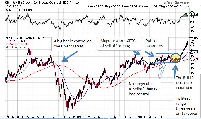
The summer sell off was underway or so it seemed – but the rally became a very tight ranged affair with each side holding off the other. The 200 day average became support –and each move above the 50 day average would be contained.
Then something extraordinary happened to price at the early July bottom and lasted through August. It went into an even tighter price trading range. The tightest range in three full years as bull’s and bears became locked in the battle for control of the MARKET. (See yellow circled area on chart).
Silver went into a trading range of 17.50 – 18.50 and remained there through the summer. THIS WAS THE FINAL showdown area where the long term demand/supply dynamics met. The tight consolidation persisted and the short positions kept growing and growing -- but the price would not break below 17. The underlying demand was like a brick wall. A last attempt to hold the market down resulted in this final tight price range.
By August the seasonal end to metal weakness had arrived on the calendar for metals. The stage was set. The transfer of control was complete. Was it the bulls or the bears who had gained control?
The final turning point for silver took place on September 1st. After a strong two week rally off the 17.25 area --- and with silver at 18.90 -- the internet waves hit with this story:
JP Morgan Chase to Close Proprietary Trading Unit, Rivals May Follow Suit
I cannot tell you exactly how big of a part this may have played, but when combined with the strongest seasonal month of the year for the metals, and the fact that JP Morgan was holding 40% of all silver shorts, and with price so compressed, that a flash point occurred in the market.
This brings us to the second part of the story.
After a review of the chart above and we can see how this scenario played out. Yes, it came as supplies where dwindling already and all the other fundamental bullish arguments. I am not downplaying that. But the point is no matter what the reasons are – the fundamental demand/supply equation has to come to a head at some point. Giving the shorts no ceiling position to short the market for the length of time it went on is like extending credit to a gambler in a poker match in when the cards are not going his way. At some point – his credit limit is reached. It seems the limit may have been reached by the shorts. It seems as we have seen the flash point. With every other asset in fraud or manipulation on earth – was it any wonder the metals weren’t?
There are two types of silver bulls. Those who bought and have been buying and those who have always planned to buy some – or add to existing positions but haven’t.
Part of the problem is that while we know about these fundamentals we are at times reluctant to take a position for one reason or another. After all, the chart time line above was constructed with HINDSIGHT. Had silver not rallied to $25 the chart would not have any significance.
One of the clue's analyst's look for to find the sweet spot of metal rallies is when silver takes the lead from gold. In this phase of the gold rally --- (gold is now up 100% since the November 2008 lows) speculation increases as gold gets closer to front page news by making new highs and taking the lead in the financial world. As more and more speculators and the public begin to arrive, the tendency is that enough of them turn to silver as the lure of the fundamental picture, the lower price, diversification (if they already own gold) and the greed factor all come in to play. This overrides demand at a key time.
But how do we know when this sweet spot occurs? How can we better understand the timing of when the fundamentals of supply/demand meet? The answer is the same way we visualized this story so far --by use of the PRICE CHART as in the one above. Charts are where price DISCOVERY works for me. If a Doctor wants to medically see how healthy or sick a patient is – they look at the chart and the data– not just the person. We can say the same for commodity prices to a great extent. Charts are important.
One of the things we do a lot of in this fast paced, got to have it today world, is that we spend an awful lot of time on the short term fluctuations of price. We are so prone to this effect that we consider looking at a weekly chart for 3 or 4 years to be a long term look at price, and certainly it is a long term look. But I am talking about a LONGER TERM CHART.
If you have a little experience (or a lot) in charting – you know that price breakouts are certainly important. If they are important on a daily and weekly chart – they are also important on a monthly chart. In fact, if we think about it, wouldn’t the BIGGEST MOVES then come when a real long term breakout develops and a major price zone is violated? Isn’t that the definition of a bull market?
The chart below is one from a snapshot that was taken on August 20th. For posterity I left it on the home page at www.goldtrends.net since that time. The date and price is at the top right hand side.
I want to first explain the arrows. They’re constructed and begin from the peak price points of the crash of 1980 thru 1986. The arrows are carried over to right of the time lines and the chart. Chart below from: www.mrci.com/beta/ (Moore Research,Inc)
The top arrow begins at the $42 zone as recorded. The second (lower) arrow begins at the first bounce from the 1980 crash when price bounced back to the $25 dollar area in a brief spike. The third arrow begins at the reaction rally high after the 1982 low when price reached $15 in 1983. The lowest arrow begins at the secondary final spike in 1987 at the 10 dollar area. Silver remained below the last arrow (below $10 dollars) for twenty years! (1984-2004)
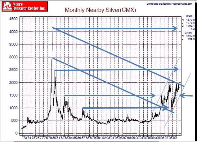
Once the 21st Century Silver Bull Market began, the breakout above the lowest arrow immediately led to a 33% spike to the 15 dollar area, where the next higher arrow was located. It stayed inside that range between the two arrows for two years. After a breakout rally to the 21 dollar area (to which there is no arrow – but where the upper channel line was constructed with the top bar of 1980) a crash all the way back to the lowest arrow developed during the 2008 world asset crisis melt down.
This latest leg of the bull market from the crash low rallied right to the channel line. The tiny blue arrow shows the point of the 2010 manipulation low described earlier in this report. Price for the last time reached $15 dollars.
This brings us to August 23rd 2010, when the chart was originally constructed. This is where the long term price channel came into play as price had moved to the lower boundary of the channel line under $20. We posted the chart on our homepage and wrote this:
“At the moment this upper resistance line is the most important factor on the monthly chart as pertains to price. It is the final barrier of resistance until the 2008 and the $25 dollar area. Any move above the $20 dollar area would suggest a rally to $25.”
Fast forward to this week and the updated chart below shows price has reached the $25 dollar arrow. Observe the price spike once it cleared the channel line at $20 - a seven dollar rally transpired in two months. The price action is confirmation that that “market” recognized this area as a MAJOR point. www.mrci.com/ (great long term charts) Moore Research Center, Inc.
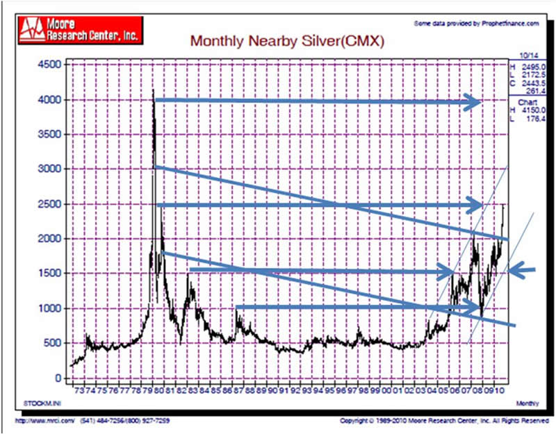
Long term charts play an important role if you’re an investor, and if we think about it, even if you’re a trader. Having a major breakout on a chart like this can go a long way in not only understanding the trend, BUT HOW EXPLOSIVE it might be because the “degree” is a long term point and more powerful.
Long term price charts don’t often give buy signals, but that is the point of watching them. When they do, the moves can be huge and you’ll know the “potential” to move will be greater. Long term charts should be reviewed once a month regardless of your time range from investor to trader. It can lead you to where the big trends are most likely to occur. When was the last time you looked at a 30 or 40 year chart of your favorite commodity? Make it a point to look at them once a month. Look at their message. Is there a major area that price is at and ready to move through or break down from?
What Next?
The chart below zooms in on a daily scale to show the massive breakout in silver and how the $25 dollar area is important on this chart as well. The upper momentum line here also points toward the $30 dollar area as does the monthly.
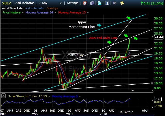
The key question now is whether this channel line will provide a price support or whether a seasonal pullback from here develops and the line becomes resistance.
Working with price channels is one way to glean clues of where KEY price points can occur. It’s one of the purest technical ways of looking at the market for the simple reason that channel lines are based on the markets outer price symmetry and play a part in its construction. The channel lines on this chart play an important role for price points.http://www.freestockcharts.com/ (BestFreeCharts.Com)
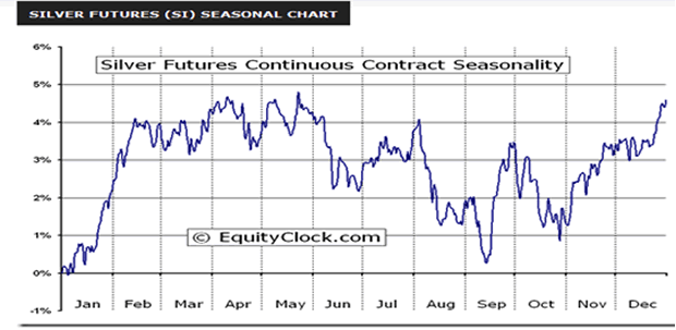
The seasonal chart below shows a likely time on average for a price pullback is October. With silver at $25 and price right at a key channel line, and with a very ovextended technical condtion, might we be in for a pullback into month’s end? If we are witnessing a short squeeze, will we even get a pullback?
While everyone seems to tell you they know for sure – there is one thing I do know. Smart traders and investors don’t step in front of freight trains. They ride them. Yet that is not what most traders do. They are usually busy looking for a top from which they should short it at. They think the price has gone too high too fast and might make a buck real quick. How much easier it would have been to just go long on the monthly breakout. But most do not follow long term charts. A $20 dollar silver price sounds like a bargain.
If one is to make money in the markets – he must not do it trying to pick exact tops or bottoms – but to identify trends that have duration and momentum behind them. Whether you day trade or you’re a long term investor the strategy should be the same.
In commodities the only thing certain……..is that nothing is certain. It seems a major change developed in the silver market last summer. The bears lost control of the market. While we don’t know who will win the short term battle or the long one for that matter – for the moment we can use the CHANNEL LINE at $25 as a PIVOT.
Above that line and the potential for another escalation to $30 becomes possible. Below that line will be a subtle hint that a short term pullback or even a correction might come into play.
Price is not about to stop here and settle down. REGARDLESS of higher or lower, BIG moves are coming.
In summary the channel lines on the chart have a very wide range. The $21 dollar area on the downside and the $30 dollar area on the upside encompass the channel. The mid line channel here at $25 makes for an excellent PIVOT point as to higher or lower and is an easy round price point to keep in mind.
We are now at the next juncture in the 21st Century Silver Bull market. Do you know where your trend line and potential price turn points are? Have you hugged your monthly charts lately?
At our website, we monitor the silver price pattern on an hourly, daily, weekly and monthly chart basis. And we offer commentary on what we think it all means for price, along with support and resistance levels for each day. We also follow the gold market extensively and are just as passionate about it.
If you would like to join us for a month and follow along with a free pass, send us an email at Goldtrends@gmail.com. May you all prosper.
Bill
’s. He writes articles for public distribution for other newsletters and websites as well as his own free site at: http://www.goldtrends.net/Email: Goldtrends@gmail.com
© Copyright Bill Downey 2010
Disclaimer - The opinion expressed in this report is the opinion of the author. The information provided was researched carefully, but we cannot guarantee its total accuracy. The report is published for general information and does not address or have purpose or regard to advise specific investments to anyone in the general public. It does not recommend any specific investment advice to anyone.
© 2005-2022 http://www.MarketOracle.co.uk - The Market Oracle is a FREE Daily Financial Markets Analysis & Forecasting online publication.