British Petroleum (BP) Stock Price Valuation Analysis
Companies / Oil Companies May 19, 2010 - 03:16 AM GMTBy: Mike_Stathis
 A couple of weeks ago, I released a report discussing how I was able to get in on Merck for big gains, while virtually everyone else left the company for dead after the Vioxx scandal played out. http://www.avaresearch.com/article_details-527.html
I used that example to give readers an idea what they need to do to determine whether a stock should be bought after a catastrophe, and when to buy it (I show several other examples in The Wall Street Investment Bible). Finally, the article illustrates that you need to have an exit strategy in advance. As I mentioned, it was a prelude to a report I would be writing for BP.
 Despite problems for BP, it is apparent that Wall Street has been unwilling to let the knife fall as much as it should. The support for BP shares (relative to the nature of the oil well leak and the uncertainty involved) has been overwhelming.
I have already discussed BP in last month’s newsletter (and the recent special report). Here, I am going to provide readers with a charting analysis that should help them understand whether and when to buy BP.
Note there are many other things one should consider. However, a charting analysis is perhaps the most time-effective manner by which to determine whether and when to catch a falling knife, at least for blue chips.
As subscribers of my newsletter know, yesterday BP hit my initial entry price of $45. Meanwhile, a lot of suckers have been buying shares all the way down; shares that others have been wise enough to unload.
Much has changed since then when it was floating around $52.
- Oil prices have collapsed
- Attempts to contain the leak have failed
- The stock market is down
- Washington is discussing modifications of liability limitations for oil spills
Given these developments, shares have held up rather well in my opinion. As a result of these new developments and the relative share strength, I am holding off for now and waiting for further weakness in the market.
As well, I want to see whether the weakness in oil will worsen or at least persist. If either of these conditions is met, it is likely that shares will decline further.
If neither of these conditions is met, it won't matter because (for me) shares must be trading at a very compelling price after factoring the uncertainty and current risks. All that says is that I have a certain use for BP as an investment. Others might see compelling value in the share price right now, which is fine as long as they understand the scenarios and know how the position fits within their portfolio.
As these new developments progress, I expect the overwhelming support for BP by Wall Street to fade, sending shares down to the low 40s, at which point I will reexamine a partial entry.
Of course, the ability or lack thereof of BP to contain and stop the leak will have a significant impact on the direction of shares.
Furthermore, there is a pretty good chance that shares will mount a considerable rally prior to falling further. Such a rally could be sparked by news that BP has stopped the leak (only later to have problems, or later the damage estimates will flood the media) or by a rally in oil and/or the stock market.
In contrast, for some investors, taking a partial entry into BP might be advised. Who these investors are depends on many things and will be based on estimates of market risk (I will make these distinctions and explain the rationale in the June newsletter).
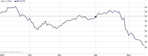
The first chart represents the closing price of BP from the past month (April 20 to May 17). As you can see, shares have fallen from nearly $61 to $46.57 ($45.57 intraday on May17). A few days earlier, shares actually hit the year-high of over $62.
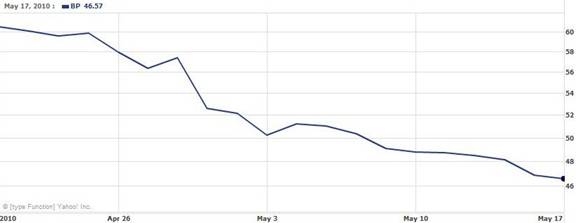
You should note that yesterday’s intraday lows are very close to the year-low of $44.62 made in early July of 2009.
The second chart puts this price decline into perspective. As you can see, since April 20, 2010, shares have declined by nearly 25% versus just over 4% for the DJIA and about 8% for XOM.

The next two charts represent the historical share price of BP and XM respectively. First, you should compare the relative volatility between each chart.
This is a very important exercise that very few investors (including professionals) bother to perform because they fail to realize its utility.
So why is it such an important exercise to perform?
Virtually every (sophisticated) investor looks at beta to determine price volatility. Of course they do this in order to understand how the security might affect their portfolio. Fund managers actually use individual betas to determine a composite portfolio beta, which gives them a good idea how volatile the portfolio is.
The problem is that beta values only go back to around three years. And economic cycles don’t really change much over that time frame, so you don’t know how the price volatility changes throughout the economic cycle.
In addition, other events occur, some company-specific, others industry-specific, and even others that are more widespread. These changes alter the volatility of each security in a specific manner. Thus, examination of longer-term price volatility can tell you much about the stock and even the company. However, beta often does not give you an idea how the security reacts to these events because the time span of data used to calculate it is relatively short.
So beta is fine if you’re a short to intermediate-term trader. Long-term investors need a better gauge of volatility.
But why? After all, long-term investors aren’t so concerned with volatility right?
Theoretically, yes. However, by understanding the volatility, even long-term investors can better determine entry and exit points based more on long-term price volatility cycles rather than short-term price inefficiencies (which are more reflective of beta values).
So how does one examine longer-term price volatility patterns? By examining the long-term chart of the security of interest and comparing price movements to peer securities and appropriate indexes.
Even short and intermediate-term traders can benefit from studying longer-term price volatility patterns.
Think of it this way. The best way to understand an individual’s personality is by knowing how they developed from an infant through adulthood. Parents have a chance of understanding their offspring better than anyone because they have tracked their development for many years; they have more data. In contrast, strangers (who have not seen the person develop and mature) are more apt to misinterpret a person based on their own perception because they have less data to go on.
Now if you think securities price movements have nothing to do with understanding human behavior, I suggest you get up to speed.
Investors can achieve the same level of understanding about a stock by examining the historical price chart. Therefore, if you want to better understand the “personality” of a security, you want to examine the historical price chart. The better you understand the personality of a security, the better you will be able to predict how it responds to a variety of variables.
Make no mistake. This is a very powerful tool when used appropriately. It is something that I learned on my own while managing assets on Wall Street. But this is the first time I have ever revealed this secret to the public.
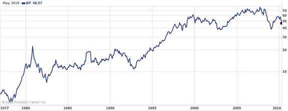
As the following chart illustrates, shares of BP have experienced cyclical periods of high volatility.
Now let’s compare BP’s chart with that of XOM.
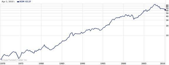
As you can see, BP has been considerably more volatile than XOM. In part, this may be explained by the difference in business for each company. XOM is more diverse than BP. For instance, its retail business is much larger than that of BP.
Furthermore, XOM sells oil to consumers and service facilities that provide oil changes. In addition, XOM has numerous express oil change facilities. While BP may also operate similar business lines, XOM has a significant retail component.
There are many other differences, but these few examples offer possible reasons that might explain the difference in price volatility. Whether or not these differences have accounted for variations in price volatility and securities performance cannot be conclusively determined. There are certainly many other variables. What is most important is to note the difference in price volatility regardless of the reason.
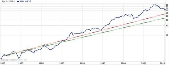
The next two charts are the same as the previous two, except I have drawn in a red and green line to show a rough estimate of the long-term fair value of each security. These lines have been drawn based on numerous variables.
The variables are firm-specific, industry-specific, and market-specific. However, there are additional variables I have not factored in (in order to keep the exercise simplified) which would alter these valuation estimates.
For instance, valuation is a reflection of earnings, or how much profit the company is expected to generate. Valuation is also a reflection of business risk, or the likelihood that the company will or will not be able to continue delivering projected earnings.
Valuation directly affects the stock price. But the stock price is also affected by the equity-risk premium.
Furthermore, valuation is a refection of the dividend yield, the dividend policy and so forth.
So what does each of these lines mean?
The red line is the current fair value estimate based on the current price of oil and the current price of the stock market. There is around a 5% to 6% elasticity built into these variables. In other words, I would not expect these valuation estimates to be altered by up to 5% or 6% fluctuation in price of oil or the stock market.
It should be easy to understand why the price of oil affects the valuation of these securities. But also remember that the overall market price (market valuation) also affects the valuation of all securities, even bonds (due to the equity-risk premium).
As you can see, for BP this value comes in at around $43 based on the red line. The green line comes in at about $35.
For XOM, the red line comes in at around $49 to $50, while the green line comes in at around $35.

What about the green line?
This line represents my estimate for the fair value of each security after factoring in the fair value of the stock market (taken to be the DJIA, the real market gauge).
In other words, the green line provides an estimate of the downside risk if the stock market were to collapse (or gradually decline) to fair value, which is currently around 6500 based on my analysis.
Now don’t panic. Similar to individual securities, the stock market can and very often remains overvalued for a long time. The reason for this is due to the continuous pressure from those in control of the economy (Washington and the Federal Reserve) to create bubbles.
In addition, you need to keep in mind that when stock market (or an individual security) corrects from a long period of overvaluation, it almost always undershoots the mark, or falls below fair valuation. That is, the security or stock market becomes significantly undervalued. Therefore, the green line does not illustrate the absolute downside risk, although it’s a good measure since these undershoots are usually short-term.
Incidentally, when the stock market corrected in March 2009, it reached pretty close to fair value, but it did NOT undershoot. This is worrisome because the undershooting process is what establishes a real capitulation. Of course, that assumes that my estimate for fair valuation was accurate.
When the stock market does not undershoot after a long period of overvaluation, rather than capitulation, you usually get one or more bear traps.
As subscribers to my newsletter know, I kept them in the market ever since my initial buy signal at 6500. Now you know why. While the market collapse did not undershoot, (as I warned of this possibility while issuing my buy signal) I was not certain it would do so. In addition, I might have been off a bit for my estimate of fair value. Regardless, I felt it had a good chance of mounting a rally somewhere near the 6500.
However, as subscribers also realize, I have been very cautious because it is my opinion that the market will at some point fall by a large amount. It is very possible that new lows will be made, most likely sometime after 2010, although it is absolutely impossible to know in advance.
If these lows are not at least retested by 2012, there is a good chance they will not be tested in this cycle.
Now, I do not want you to get the impression that we are in the economic cycle because what we are seeing in no way resembles a typical economic cycle. All of these economists who keep referring to the economic cycle right now are completely wrong. If you do not know who to believe, I suggest you compare my track record to theirs. The cycle I am referring to is the secular bear market, which arguably began in 2001. In contrast, a depressionary period (which is what we are in) does not fall within a typical economic cycle.
The next chart compares BP and XOM over the past three years. As you can see, the region where these two securities diverge in price has been encircled in green. As you will recall, this region includes the correction in the commodities bubble, followed a few months later in 2009 by the collapse of the stock market down to its 6400 lows.
First, notice that both BP and XOM shares collapsed by about the same amount from August through October. This was during the collapse in oil prices from the $147/bbl high.
Shortly thereafter, you can see that XOM began to recover very well by the end of 2008, while BP was headed down.
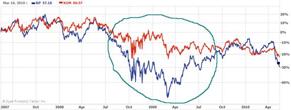
In March 2009 when the DJIA collapsed, BP and XOM fell by about the same amount. However, because XOM has regained much of its losses during its rebound seen in November and December of 2008, its decline in March 2009 was not as severe relative to the pre-divergence period (early summer of 2008).
In the next chart, I show the past two years relative performance of BP and XOM. As you can see, where the left part of the green circle intersects the chart (late December 2009), XOM began underperforming BP. This is very important because XOM had outperformed BP for several years.

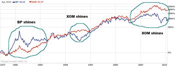
As the next chart shows, BP has pretty much traded in line with XOM except in the late ‘70s and early ‘80s, when it spiked, only to come back down a few years later. Also, XOM shows two periods of significant outperformance that were not price spikes, and thus more characteristic of true outperformance. The most recent outperformance period by XOM (2003 to current) has been perhaps the most significant.
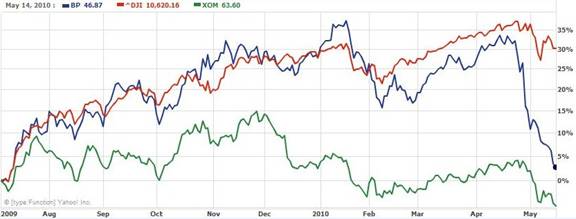
The next chart spans the previous year. As you can see, while BP has traded pretty close to the DJIA, XOM has underperformed by a rather significant amount. Even with its current oil well issues, BP has still out performed XOM over the past year.
The next chart is year-to-date. More recently, BP experienced a nice surge beginning in April (where the dot is marked). A couple of weeks later, the disaster happened.
The next chart is also over the same time span. It shows the relative performance of BP, XOM and the DJIA. As you can see, BP outperformed XOM by about 4% just prior to the oil well leak.
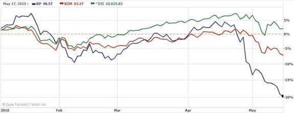
So what does all of this mean?
First, you can slice 4% off the top of BP shares from the beginning because this was due to short-term overvaluation. What that means is that rather than calculate the fall from the recent $62 high, you must start with about $59. In other words, the fall in price BP experienced in the early stages of the oil well leak down to $59 had not factored in any damages, although most investors do not realize that.
The second point is that based only on this charting study, over the next few months, the performance gap between BP and XOM is likely to begin closing. In other words, BP will bottom and begin to gain on XOM; XOM shares will begin to lose more than BP; or some combination. This is based on the charting analysis presented in this article, although there are certainly numerous other variables at play.
Finally, from a longer-term standpoint, it would appear that XOM has more potential downside than BP based on current prices.
There are many other things to consider besides this simple charting study. I plan to go over some fundamentals and other considerations in the June newsletter.
If you are an investor, whether you have a 401(k), IRA, or you invest in individual securities, you need to be armed with the best available insights. You can get them by subscribing to the AVA Investment Newsletter. Check here for partial samples.



By Mike Stathis
www.avaresearch.com
Copyright © 2009. All Rights Reserved. Mike Stathis.
Mike Stathis is the Managing Principal of Apex Venture Advisors , a business and investment intelligence firm serving the needs of venture firms, corporations and hedge funds on a variety of projects. Mike's work in the private markets includes valuation analysis, deal structuring, and business strategy. In the public markets he has assisted hedge funds with investment strategy, valuation analysis, market forecasting, risk management, and distressed securities analysis. Prior to Apex Advisors, Mike worked at UBS and Bear Stearns, focusing on asset management and merchant banking.
The accuracy of his predictions and insights detailed in the 2006 release of America's Financial Apocalypse and Cashing in on the Real Estate Bubble have positioned him as one of America's most insightful and creative financial minds. These books serve as proof that he remains well ahead of the curve, as he continues to position his clients with a unique competitive advantage. His first book, The Startup Company Bible for Entrepreneurs has become required reading for high-tech entrepreneurs, and is used in several business schools as a required text for completion of the MBA program.
Restrictions Against Reproduction: No part of this publication may be reproduced, stored in a retrieval system, or transmitted in any form or by any means, electronic, mechanical, photocopying, recording, scanning, or otherwise, except as permitted under Section 107 or 108 of the 1976 United States Copyright Act, without the prior written permission of the copyright owner and the Publisher. These articles and commentaries cannot be reposted or used in any publications for which there is any revenue generated directly or indirectly. These articles cannot be used to enhance the viewer appeal of any website, including any ad revenue on the website, other than those sites for which specific written permission has been granted. Any such violations are unlawful and violators will be prosecuted in accordance with these laws.
Requests to the Publisher for permission or further information should be sent to info@apexva.com
Books Published
"America's Financial Apocalypse" (Condensed Version) http://www.amazon.com/...
"Cashing in on the Real Estate Bubble" http://www.amazon.com/...
"The Startup Company Bible for Entrepreneurs" http://www.amazon.com...
Disclaimer: All investment commentaries and recommendations herein have been presented for educational purposes, are generic and not meant to serve as individual investment advice, and should not be taken as such. Readers should consult their registered financial representative to determine the suitability of all investment strategies discussed. Without a consideration of each investor's financial profile. The investment strategies herein do not apply to 401(k), IRA or any other tax-deferred retirement accounts due to the limitations of these investment vehicles.
© 2005-2022 http://www.MarketOracle.co.uk - The Market Oracle is a FREE Daily Financial Markets Analysis & Forecasting online publication.


