


U.S. Dollar Premature Death Rumours and Necessary Stock Market 40% Plunge
Stock-Markets / Stocks Bear Market Oct 30, 2009 - 05:54 AM GMTBy: Brian_Bloom

 Summary and Conclusion - Rumors of the US Dollar’s death may be premature. Indeed, rumors of the US economy’s death may be premature. What is needed is a period of cathartic healing to facilitate a process of ecdysis (shedding the old skin to reveal a new and healthy skin beneath). The equity markets need to be allowed to breath out and contract. A fall of up to 40% from current levels is necessary. Below the level of its immediately visible surface the US economy still has the potential to remain a powerhouse in the world economy.
As more and more chartists join the writhing throng of investment analysts the resulting technical static has made it increasingly difficult to interpret the true underlying meaning of price movements. One way to pierce the veil of this confusion is to choose a scale on the charts that is designed to filter out the noise. For example, a monthly chart may be regarded as more meaningful than a daily chart when viewing the likely direction of the Primary Trend.
Below is an example of a 3% X 3 box reversal Point and Figure Chart of the ratio of the 30 year bond yield and the 10 year bond yield. In theory, if the world is worried about inflation then longer dated bond yields should be rising faster than shorter dated bond yields – because of the “time value of money” – and the directional trend of the chart should be “up”. (Chart courtesy stockcharts.com)
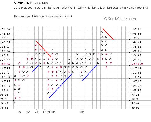
What this chart shows is that there “may” be an emerging fear of deflation – given that the ratio may merely be bouncing up within the confines of a falling trend.
However, if we change the scale of the chart to that of a 4% X 3 box reversal, then the following picture emerges
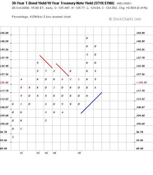
What this chart shows is that, since 2001, the markets have been largely undecided about whether we are facing either inflation or deflation. There was a brief flurry in 2009 when the fear of inflation burst forth but this fear has receded. Certainly, there is no sign (yet) of a fear of deflation.
So, with this issue of “scale” in mind, let’s look at the Point and Figure charts of a few other ratios using a 5% X 3 box reversal
For example, let’s turn our attention to the ratio of the gold price to the Industrial Equities (Dow Jones). Clearly, the chart of this ratio has been in a rising trend since 2001.
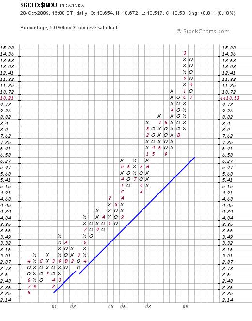
Hmmm? That’s interesting. If the gold price has been rising relative to industrial equities, but the relative bond yields are not signaling that investors are worried about inflation, then why has the gold price been rising?
Well, first off, we need to determine whether commodities in general have been rising relative to industrial equities. This will tell us whether the issue may be related to a general downtrend of the US Dollar – because commodity prices are generally denominated in US$.
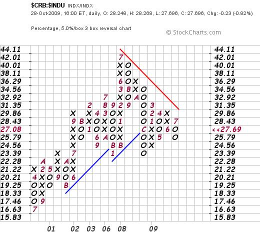
The chart above is very interesting. It shows that for the past two years or so, commodities have been falling relative to industrial equities. (Or have been marking time relative to rising industrial equities)
On a broader scale (7.5% X 3 box reversal) commodities can be seen to have been moving sideways relative to equities since about 2002; except for a brief flurry in 2008 – which preceded the flurry in bond yields. Arguably, it was the rise in commodity prices that gave rise to a (belated) fear of inflation and caused the longer dated bond yields to rise.

OK. So why has the gold price been rising?
Arguably, from the chart below, the cause has indeed been a weakening US$ but the context may have been currency related rather than commodity related.
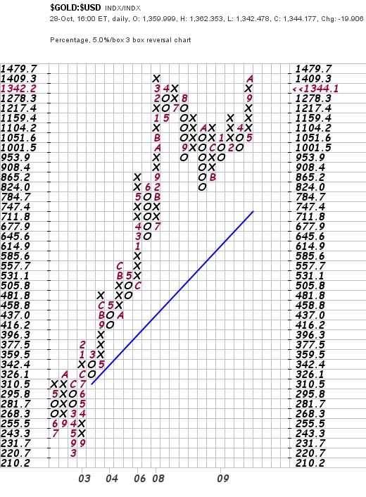
The reader is cautioned not to get carried away with dogma. The chart above, whilst extraordinarily strong, may be showing a “double top” formation. This formation may be regarded as potentially bearish for the ratio (in the foreseeable future) because the ratio itself has risen far above its rising trend line. Technically, the ratio is severely overbought.
This overbought situation may be more clearly seen in the following chart (also courtesy stockcharts.com)
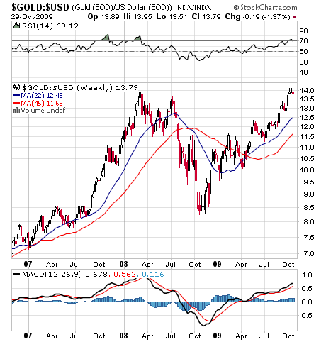
Note how the RSI oscillator is turning down from the 70% line.
Unfortunately, from a purely technical perspective, the above chart also reflects a couple of significant non-confirmations.
On the one hand, the 22 week and 45 week Moving average lines (of the ratio itself) are both pointing upwards (bullish). On the other hand, the black Moving Average line of the MACD oscillator is significantly lower than when the ratio itself peaked in early 2008 (potentially bearish). Further, the MACD histograms have been showing a series of falling tops (also potentially bearish).
What might this mean?
Well, from this analyst’s perspective, the primary issue might revolve around the “dogma” phenomenon. There are many market analysts who are dogmatically of the view that the US$ and the dollar price of gold move inversely to one another – ie when the dollar falls the gold price rises and vice versa.
The problem with this argument is that whilst it may be true it is certainly – as a matter of unarguable fact – not the “whole truth”.
The reader’s attention is drawn to the weekly chart below of the Goldollar Index. This is of the gold price multiplied by the US Dollar Index. (Chart source: Decisionpoint.com)
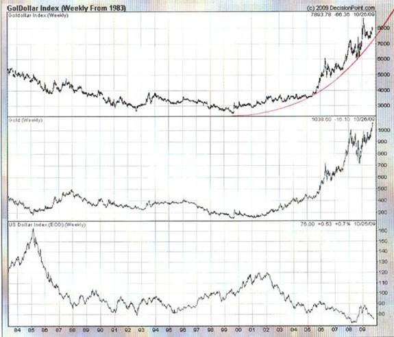
Let’s look at some basic arithmetic. Let’s assume that both the Index of the gold price and the Index of the US Dollar start of at 1.00. The Goldollar Index will be calculated as to: 1 X 1 = 1.
Assuming the two move inversely, a 20% fall in the Dollar Index to 0.8 should be accompanied by a 25% rise in the Index of the gold price to 1.25. And 0.8 X 1.25 = 1.
If the gold price and the dollar index moved inversely, then the chart of the goldollar index should be a horizontal line. But if you look at the chart above (the one with the exponentially upward curving red trend-line) the chart is clearly not a horizontal line.
There is a technical nuance in that the scale of the chart above is arithmetic as opposed to logarithmic and so, arguably, the picture that it is reflecting is misleading. Therefore, for the purpose of being anally correct, lets go back to 2002, and the following manifests: (Note The numbers are approximate, having been visually derived from the above chart)
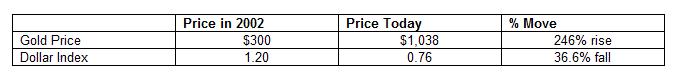
Assuming a starting index of 1, the Gold Index would have risen from 1 to 3.46 and the US Dollar Index would have fallen from 1 to .634
(1 + 2.46) X (1-.366) = 2.19.
Clearly, 2.19 does not equal 1! The fact is that the US Dollar has been falling at a slower pace than the gold price has been rising.
So what might all this mean?
There are those who are arguing that world is slowly moving back towards a gold standard, where fiat currencies will be backed by gold. About a year ago, this analyst posted an article which “calculated” the theoretical price to which gold would have to rise to facilitate this outcome (see: Gold at $14,172 an ounce? ) The price he arrived at was $14,172 an ounce and the calculation gave rise to a deluge of critical emails because the number of ounces in a pound was overstated. The calculation should have been based on “Troy” ounces (12 Troy ounces to the Troy pound) and this analyst had used Avoirdupois ounces (16 Avoirdupois ounces to the Avoirdupois pound). This analyst didn’t bother to correct the error because the result would have been an even higher theoretical gold price – somewhere north of $18,000 an ounce.
What the >$18,000 an ounce really means is that the probability of the world economy ever going back to a “pure” gold standard is vanishingly small. We may incorporate gold somehow into a new currency system, but a move from $1,000 and ounce to >$18,000 would, in all probability, cause massive economic dislocations across the planet. (And, as an aside, these calculations assume that all the gold that is supposed to be in Fort Knox is actually there. There has been no audit done since the 1950s – which is what Congressman Ron Paul is now attempting to address)
The flip side of this potential for economic dislocation is that, in all likelihood, the US Dollar Index will never see “zero” because paper currencies cannot be jettisoned completely.
Well, with this in mind, is there any technical evidence which supports the hypothesis that the US Dollar might rise from here? Yes there is. For example, the following long term chart (without the red lines) was sent to me by a friend. It was apparently reproduced from an article written by Jim Sinclair.
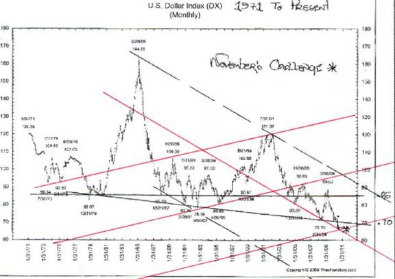
What this analyst did when he saw this chart was he superimposed some highly subjective Gann lines. The first one was the downward pointing red line which touches 6 points and is therefore probably valid. Interestingly, it falls roughly equidistant from the two descending black parallel lines. The first two upward pointing red lines were derived by joining rising tops and rising bottoms and, when this analyst had completed the task of drawing them, he noticed that the distance between them was visually very similar and the angles of incline are virtually identical. He concluded that these lines were probably Gann lines.
In the late 1970s and early 1980s, Daan Joubert had written a software program that was decades ahead of its time; long before MS Dos was able to handle graphics. Amongst other things, it incorporated Gann analysis and this analyst spent many hours on his Sirius computer working with this analytical tool. It was therefore “experience” and nothing else that encouraged him to draw the last rising red line at a distance and angle of incline which happens to be similar to all the other distances and angles.
If this last red line is valid, then (technically speaking) the US Dollar Index should encounter significant support at this level. Put another way, if the lines are genuine Gann lines, we might see a significant rise in the US$ Index – possibly to as high as 0.85. At that point (should it happen), a question will arise as to whether the US Dollar will resume its Primary Down Trend or enter a new Primary Up Trend.
Once again, we need to dispense with “dogma”. Yes, the gold price and the US Dollar “obviously” move inversely to one another. (Proven above to be only partially true). Yes, the Dollar is obviously stuffed. But, to paraphrase what Joe Granville was fond of saying: “If anything on the markets is obvious, then it’s obviously wrong.” Clearly, if “everyone and his brother” is of one view, then there will be no source of energy left to continue to drive the prevailing trend. When “everyone” has arrived at what appears to be unanimous view, then that point is probably a turning point.
Is there any other technical evidence that we might have arrived at a turning point?
Yes, there is. Have a look at the following chart, courtesy Decisionpoint.com.
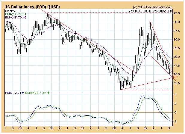
The reader should note the falling wedge pattern and the fact that the US Dollar Index seems very close to an upside penetration. Strictly speaking, one cannot call the break until after it has been made. Furthermore, strictly speaking, a “falling wedge” is typically a secondary bearish reaction within a Primary Bullish trend. Given that the Primary Trend of the US Dollar Index is “obviously” bearish, how can this falling wedge be bullish? It makes no sense. Therefore this falling wedge is “obviously” not a genuine falling wedge. (Obviously?)
Finally, it is important to look at the Industrial Equity Index in absolute terms. For the purposes of objectivity, this analyst has chosen the SPX index because the Dow contains only 30 stocks and may be open to short term manipulation.
In context of “scale” giving rise to context, the chart below (courtesy Decisionpoint.com) is probably the most meaningful of all given that it dates back to the 1920s.
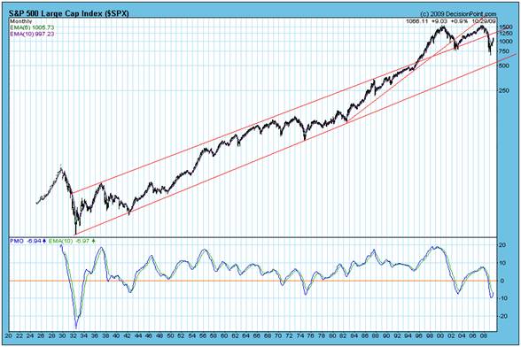
It can be seen that a sort of “mania” overcame the investment world from about 1995 to 2007 – when the index rose above the confines of its 75 year upper trend line. A Primary Bear Market typically has three down legs and two up legs – as evidenced by the 1965 – 1975 Bear Market. Conversely, a Primary Bull Market typically has three up legs and two down legs.
Arguably, the first up leg in the most recent Primary Bull Market occurred between 1975 and 1982. Thereafter, the legs might be interpreted as follows:
First Down Leg: 1982 – 1984
Second Up Leg: 1984 – 1987
Second Down Leg: 1987 – 1988
Third Up Leg: 1988 – 2000
If this interpretation is correct, then the current Primary Bear Market commenced in 2000 and the First Down Leg culminated in 2003. The First reaction Up Leg ended in 2007 and the Second Down Leg culminated in March of 2009. The “final” reaction Up Leg may be ending as these words are being written, or it may continue (possibly until it hits the resistance of the upper red trend line at around 1250). In this analyst’s view, regardless of the final culmination point of the Second Up Leg, the Third and final Down Leg will not end until the SPX reaches at least around the 600 level
Interim Conclusions
The “high level”, large scale, charts are sending out warning signals that the markets might have arrived at an important turning point, the nature of which needs further comprehensive analysis.
The Gold Price is clearly in a long term rising trend relative to both industrial equities and relative to the US Dollar.
The Gold Price might consolidate at this point but there seems to be a technical argument to anticipate a “topping out” of the Industrial Markets in absolute terms and a “bottoming out” of the US Dollar Index in absolute terms.
Author Comment
It is this latter interim conclusion that seems the most counter intuitive
One possible explanation – from a technical perspective – may be that the US Dollar might “bounce” even as the Industrial Index continues to rise to the final culmination of its second up leg. i.e. We might experience a sort of Indian Summer where things appear, at the surface, to be improving. Upon culmination, both the equity markets and the US Dollar will head south.
The problem with this explanation is that it’s too trite. It’s too neat. It’s too facile.
Another possible explanation might have to do with a possible “solution” to the question of a gold standard vs. a fiat currency standard.
When I was a child, my father often used to draw a distinction between “Old Money” and “Nouveau Riche”. In his mind, Old Money was stable because it had been derived from a compounding of investment and savings over a protracted period of time whereas Nouveau Riche were “Johnny Come Latelys” who had made money too quickly to understand the importance of savings.
The key word here appears to me to be “savings”. What does the word “savings” mean? Is it the accumulated bank balances and conspicuous wealth of the savers or is it the sum total of the breadth and depth of accumulated assets of the savers that have arisen from years of re-investment and compounding?
In my mind, it is the latter. It follows, therefore, that if we are to have paper currencies, then those paper currencies need to be backed by both visible and invisible savings. Paper currencies need to be backed by “old money” assets. To give him credit, it was something that Frank Shostak said in an article a few weeks ago that gave rise to the this line of thinking on my part. Thank you Frank.
The fact is that Gold represents only one element of savings. There are others. The sum total of what I as an individual am worth is the combination of all my assets less all my liabilities. But what I am worth goes beyond my tangible assets. I have 62 years of accumulated knowledge that I have been compounding and compounding and compounding. It is that accumulated knowledge which has enabled me to write a novel entitled Beyond Neanderthal which reflects over 45 years of cumulative thinking about the world and its problems. It is this same 45 odd years of cumulative thinking that is enabling me to differentiate the wheat from the chaff in the climate change debate (I have concluded that there is no cause-and-effect link between CO2 and climate change). I have also been applying this cumulative knowledge in my second novel; which will examine the question of Nuclear Fission as a potential alternative method (to that discussed in Beyond Neanderthal) of extracting energy from inside an atom. Beyond Neanderthal examines the possibility that there may be an alternative and non-destructive method of converting mass into energy and concludes that we should not just “dogmatically” reject this possibility.
But returning to the main issue: On a global level, it follows that the “savings” of the entire planet needs to include the accumulated intellectual property and knowledge that has been built up since the year dot.
In the year 2009, we are living in an age of science. Where does the majority of scientific knowledge reside? Where does the majority of technical understanding lie? It lies, predominantly, within the minds of the scientific and entrepreneurial community of the United States of America.
It seems to me that, as Mark Twain might have put it, “Rumors of the US Dollar’s death might be premature”.
More importantly, if the concept of accumulated knowledge, experience and proprietary Intellectual Property is factored in, then a new world currency might be backed by all “savings” which includes this particular asset as well as gold and other “hard” assets. Thus, for example, whilst China might be rich in cash savings, it is still relatively poor in Intellectual Property savings. Arguably, in this single area, China has been accumulating some of its wealth by stealth as it has allowed its citizens to become IP robbers. This has to stop! It’s one thing to build your own wealth. It’s quite another to steal another man’s wealth. In this context, the Chinese Yuan does not (yet) deserve to be the world’s currency of last resort. In this context (tongue in cheek), perhaps the USA needs to raise an invoice in respect of United States Intellectual Property that has been plundered. Hmm? $3 trillion sounds like a nice round number. What do you think?
Conclusion
Perhaps the basis for a new world medium of exchange might lie in a different way of accounting for assets and savings; and in allowing “all” savings to be the foundational underpinning of paper currencies. In this context, for example, the Zimbabwean Dollar is indeed virtually worthless, but the US Dollar is most certainly not worthless.
It’s all a question of perspective
The way forward
With all the above in mind, the underlying and unarguable fact is that the US Equity Markets are fundamentally overpriced; and the reason for this is that the US has allowed its industrial base to decay. The US is not capitalizing fully on its knowledge base. The country has been living off its savings and its citizens (consumers) have accumulated too much debt. This has to be addressed. What is needed is a cathartic cleansing. What is needed is a final washout of the equity markets as they fall by up to 40% from current levels. This will be a wake up call that a move away from consumerism is unavoidable. Those days are past. When all is said and done, we have to conserve our raw material asset base across the planet. Perhaps we should look upon raw materials as “inherited” savings.
When this realization finally dawns (of the need to move away from hedonistic consumerism), there will be a re-embracement of the work ethic on which the US was originally built and this work ethic will be applied to the massive accumulated Intellectual Property on which the USA has yet to capitalize.
Brian Bloom
Beyond Neanderthal is a novel with a light hearted and entertaining fictional storyline; and with carefully researched, fact based themes. In Chapter 1 (written over a year ago) the current financial turmoil is anticipated. The rest of the 430 page novel focuses on the probable causes of this turmoil and what we might do to dig ourselves out of the quagmire we now find ourselves in. The core issue is “energy”, and the story leads the reader step-by-step on one possible path which might point a way forward. Gold plays a pivotal role in our future – not as a currency, but as a commodity with unique physical characteristics that can be harnessed to humanity's benefit. Until the current market collapse, there would have been many who questioned the validity of the arguments in Beyond Neanderthal. Now the evidence is too stark to ignore. This is a book that needs to be read by large numbers of people to make a difference. It can be ordered over the internet via www.beyondneanderthal.com
Copyright © 2009 Brian Bloom - All Rights Reserved
Disclaimer: The above is a matter of opinion provided for general information purposes only and is not intended as investment advice. Information and analysis above are derived from sources and utilising methods believed to be reliable, but we cannot accept responsibility for any losses you may incur as a result of this analysis. Individuals should consult with their personal financial advisors.
Brian Bloom Archive |
© 2005-2022 http://www.MarketOracle.co.uk - The Market Oracle is a FREE Daily Financial Markets Analysis & Forecasting online publication.