


Fractal Analysis Suggests Higher Silver Prices Are Coming
Commodities / Gold and Silver 2012 Jan 18, 2012 - 07:00 AM GMTBy: Hubert_Moolman

 The price of a good often behaves in a similar manner at or around the same kind of milestone. An example of such a milestone could be a significant top. Price often forms a similar type of pattern at different significant tops - different in terms of time of occurrence. This is a reflection of how market participants themselves often behave in a similar manner when faced with the same kind of situation. This of course makes perfect sense, since it is normal, for example, to rest after you have been extremely busy for a while. For most people, this is true whether it was yesterday, or in 20 years.
In the current silver market, there are some similarities as compared with the 1970s. There are also things that are much different today, in the economic landscape, compared with that of the 1970s. One of the significant things that is different now is the fact that debt levels, relative to GDP, are extremely high compared with the seventies.
In my opinion, this is one of the main reasons why we are likely to have a massive Depression this time around.
Here, I would like to illustrate how the silver price behaves in a similar manner, today, compared with the 1970s. Below is a graphic that compares the silver price chart of January 1978--August 1979 to the period from January 2009--present (charts generated at barchart.com):
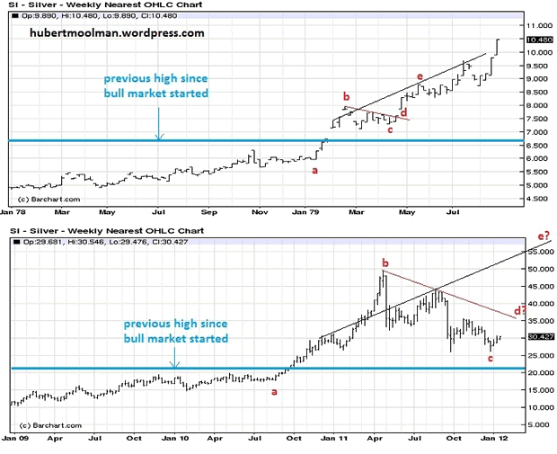
I chose these timeframes because price broke out of the significant high (for the relevant decade) around these periods. I have drawn a blue line at the level of the relevant significant high.
Note how the run-up to the blue line is visually similar in both cases. After going through the blue line, price rallied significantly until it peaked at point b (in both cases). It then corrected/consolidated forming a flag/pennant type formation.
Note that in the 70s and in the current chart, price corrected to just above the blue line. It does not mean it cannot still move to the blue line, since, to stay valid, it just needs to stay at or above the blue line. Note that, currently, I do not see any evidence that we will still go lower than the $26 level.
The comparison suggests that we should now rally towards point d and eventually go higher than point b ($50).
The flag pattern formed currently is significantly bigger (in price movement) relative to that of the 1970s. This is possibly indicating that this fractal pattern is growing significantly, which could mean, going forward, bigger price increases relative to the price increases of the 1970s.
The move from point a to point b, on the bottom chart, was remarkable. It took silver from about $17.50 to about $50, a 185% increase. Compare that to the 1970s move of 33.33% (from about $6 to $8). To me, this signals that silver has changed gears (big-time) relative to the 1970s.
The above comparison is also supported by a comparison I did for gold and silver, in a previous article.
Below is a graphic that compares the silver chart (from 2007 to today), to the gold chart (from 2008 to 2010) (all charts generated at fxstreet.com):
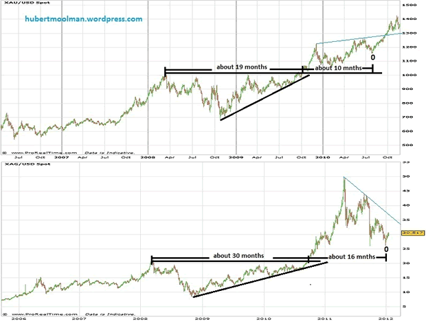
The top chart is for gold and the bottom is for silver. I have highlighted how similar patterns exist on both charts. On both charts are ascending triangles, out of which price broke out to the upside. After the breakout, price increased significantly from where both formed a consolidation pattern.
The ascending triangle for silver (roughly 30 months) is much bigger than that of gold (roughly 19 months). The consolidation patterns for both charts took roughly the same amount of time to form, relative to their ascending triangles (about half the time of the triangles).
Based on this comparison, it would seem that silver was at point 0 on 29 December 2011, and it is now busy making its way toward the blue line and will eventually pass the $50 level, just like the comparison to the 70s chart suggest.
Also, if you compare the price movement for silver after it broke out of the triangle to that of gold's movement, you will notice that there is a huge difference. Gold moved from about $1000 to $1227 (a 22.7% increase), whereas silver moved from about $21 to about $50 (a 138% increase). This, to me, says that there is a massive amount of energy underlying the silver market, and when it is ready to unleash, we will see price/value increases that will stun even the most ardent silverbugs.
The kind of movement we've seen since silver has moved out of the triangle is normally associated with moves at the end of a big move. So, either that move was the end of silver's big move, or it was just an unusually big beginning of a really big move, which suggests we will have an unusually big end of a big move (still to come). Again, I see no evidence to suggest that anything we've seen so far was the end of the silver bull market, so I am expecting the latter (i.e. a very powerful upleg yet to unfold).
The real power of this expected move is likely to be released only some time after price has surpassed the $50 level.
Below, is a video that explains the principle discussed here:
My current analysis suggests that this is likely to happen soon, since gold appears to be bottoming (or has already bottomed), whereas the Dow appears to be looking for that final point (see this article for more details).
For more detailed analysis of gold, silver and the Dow, you are welcome to subscribe to my free or premium service.
Warm regards and God bless,
Hubert
http://hubertmoolman.wordpress.com/
You can email any comments to hubert@hgmandassociates.co.za
© 2012 Copyright Hubert Moolman - All Rights Reserved
Disclaimer: The above is a matter of opinion provided for general information purposes only and is not intended as investment advice. Information and analysis above are derived from sources and utilising methods believed to be reliable, but we cannot accept responsibility for any losses you may incur as a result of this analysis. Individuals should consult with their personal financial advisors.
© 2005-2022 http://www.MarketOracle.co.uk - The Market Oracle is a FREE Daily Financial Markets Analysis & Forecasting online publication.